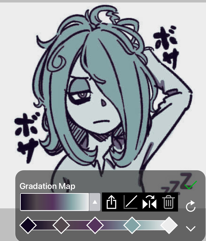
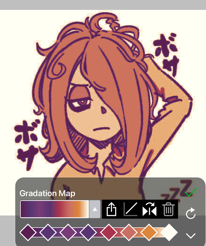
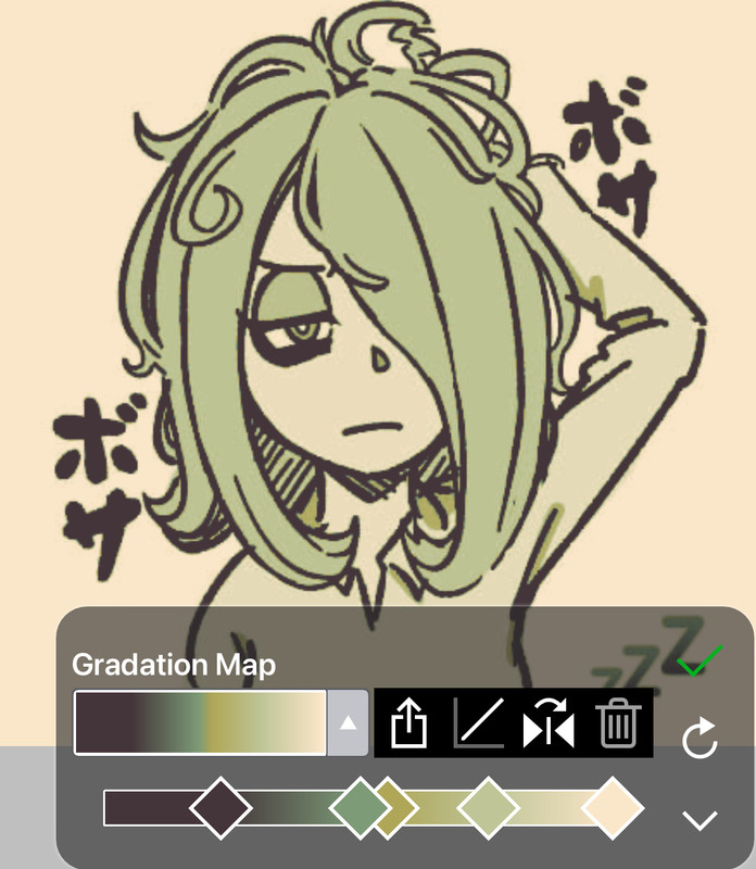
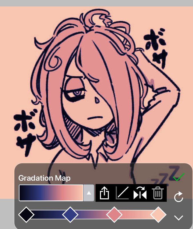
There's many valid ways to color graphics, I personally use Ibis Paint's gradient map (a pro feature) but there are tons of non-pro ibis colorings on tumblr. As well as gradient map sites (Personally, I rec — https://yoksel.github.io/svg-gradient-map/#/). You can also use parallel gradiation or what's shown in the gif below
Finding good coloring is simple, try to avoid doing one flat color unless you're coloring a manga image, its hard to colorpick & doesnt look good (when done outside of a gradient map)
pick complimentary colors for combos & when gradient mapping make sure your map doesnt alter skin too heavily!
Some Examples (f2u)
- Color Code!
make combos with lighter colors near right and have them compliment eachother (pink + anything, blue yellow etc), and when making graphics w pngs, text boxes and frames match the color of those pngs to your graphic so theh dont stick out like a sore thumb and are consitent.
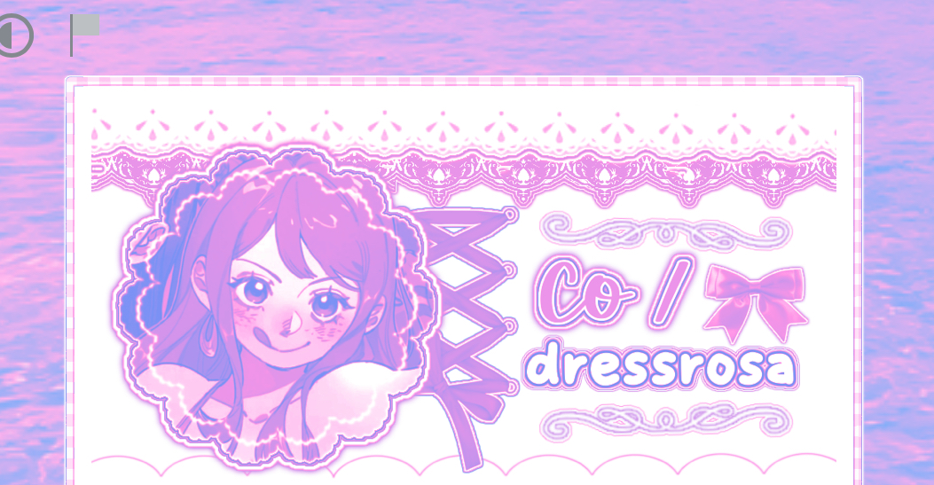
you want all components of your graphic to blend w/ the main image and work well together so edit them w the same / similar colors!